
The upcoming Nothing Phone (4a) continues the company’s tradition of bold, transparent smartphone design, reinforcing the visual identity that has defined the brand since its debut. Rather than following the industry trend of glossy, indistinguishable slabs, Nothing once again embraces a semi-transparent rear panel that showcases internal design elements. The result is a device that feels engineered, not just assembled — a phone that turns its hardware into a visual statement.
At first glance, the 4a retains the industrial aesthetic fans have come to expect, but closer inspection reveals thoughtful refinements. The exposed structural components, visible screws, and geometric panel lines create a layered look that feels deliberate and symmetrical. Nothing appears to be leaning further into its “tech as art” philosophy, emphasizing precision and minimalism over excessive ornamentation.
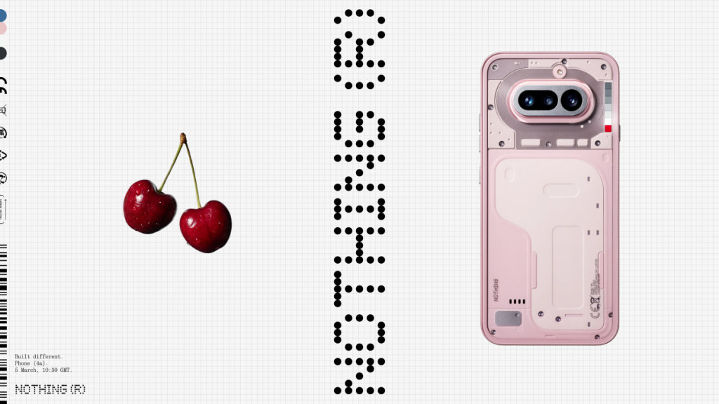
One of the most noticeable changes is the evolution of the brand’s signature lighting interface. The redesigned Glyph lighting system introduces a cleaner, more structured layout on the rear panel. Instead of wrapping light strips around the camera housing in segmented patterns, the new approach consolidates the LEDs into a more organized visual element. This gives the back of the device a more cohesive appearance while still delivering functional notification lighting.
The updated lighting array is also brighter and more refined than previous versions. The illumination feels less flashy and more purposeful, suggesting that Nothing wants the Glyph system to feel like a polished feature rather than a novelty. Users can expect customizable alerts and subtle visual cues that enhance usability without overwhelming the design.
Camera placement has also been subtly adjusted. The dual-lens system sits within a horizontally aligned module that integrates more smoothly into the back panel. The framing around the lenses looks more refined, with softer transitions between materials. This contributes to a cleaner, more mature aesthetic compared to earlier A-series models.
In terms of overall shape, the Nothing Phone (4a) maintains gently curved corners and a slim profile. The flat-edged frame offers a modern, confident look while also improving grip. Button placement appears slightly elevated along the side rails, potentially improving ergonomics and one-handed usability.
Color options expand the personality of the device. Alongside the classic black and white variants that emphasize contrast within the transparent design, a new soft pink option introduces a more expressive twist. The pastel hue complements the industrial detailing rather than overpowering it, signaling a willingness to experiment without abandoning the brand’s core identity.
Despite its artistic appearance, the transparent back is not purely cosmetic. The visible components are carefully arranged, suggesting that Nothing continues to value structural clarity and internal organization. This approach gives users a sense of authenticity, as though they are seeing the blueprint behind the product rather than a decorative shell.
On the front, the device is expected to feature slim bezels surrounding a vibrant AMOLED display. The minimal front design contrasts nicely with the more intricate rear, creating a balance between immersive screen space and expressive hardware styling. The symmetry between front and back ensures the phone feels premium from every angle.
Overall, the Nothing Phone (4a) appears to be an evolution rather than a dramatic redesign. It refines what already made the brand recognizable — transparency, purposeful lighting, and minimalist geometry — while smoothing out rough edges from previous generations. In a market saturated with look-alike devices, Nothing’s latest design continues to stand apart by celebrating the beauty of exposed technology rather than hiding it.